Lady Sabre and the Pirates of the Ineffable Aether

TITLE: Lady Sabre and the Pirates of the Ineffable Aether
STORYTELLERS: Greg Rucka and Rick Burchette
PUBLISHER: webcomic (self published)
YEAR OF PUBLICATION: 2011-2012
PAGE COUNT : approximately 100 screens (series to date at the time of review)

WHAT I LEARNED ABOUT WRITING / STORYTELLING :
1.  A bunch of pirates get in an old fashioned 1700s style ship and travel through space, real world physics be damned! It shouts “This is fantasy” from the very beginning.  It’s a fantasy world unlike most I recall seeing.

2.  There’s genre mashup: it’s a bit wild west, a bit steampunk, and a bit of a pirate/  Horatio Hornblower sort of thing. This shows when you create a fantasy world you can include elements of different things from different periods and cultures.

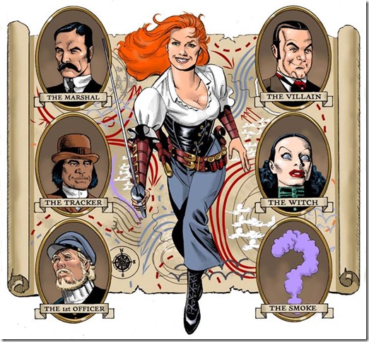
3.  I liked the splash showing the cast of characters with a question mark for the mystery villain called “The Smoke”:
lady sabre montage

4.  There’s a mysterious mcguffin (a mysterious locked box that only a key can open, it’s sealed with a magic spell).  You just go along with it and don’t think “Oh This is a McGuffin!”

WHAT I LEARNED ABOUT ART / STORYTELLING
1.  The team does a webcomic that sometimes has two screens on a page instead of one, allowing for a sort of vertical double page splash.

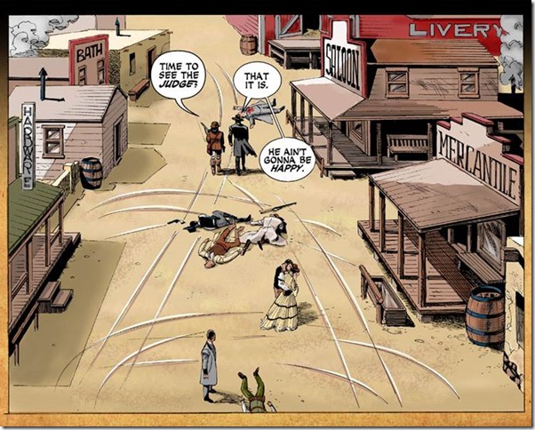
2.  I liked how the final splash panel of this scene is a long shot with the characters walking away after killing the bad guys.  You see the chaos around them:
long shot from lady sabre
I guess splashes are not just for big shots of people hitting things!

RECOMMENDATION: B

NOTES / REVIEW / SYNOPSIS:
This is definitely different from what Greg Rucka usually writes.  He says he wanted to do a “fun” series, and it mostly works, though Lady Sabre’s cheeriness while killing people is a bit odd.  Not that a swashbuckler can’t be cheerful, but she seems to take it to an extreme level- some more neutral moments or more of a range of emotional reactions to a situation might be nice. I could relate more to the grim sheriff character.

Hardware Volume 1

Storytellers: Written by Dwaine McDuffie, art by Denis Cowan and JJ Birch
Publisher: Milestone and DC Comic
Year of Publication: originally published 1992-1993
Page Count: 8 issues

What I learned about Writing/Storytelling:
1.  I guess this book demonstrates the basic idea of a story arc. Hardware is something of a jerk when first we meet him. By the end of volume, he is guilty about this and trying to reform himself.
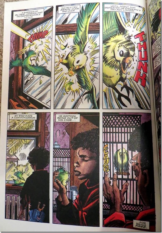
2.  This book starts out with an extended metaphor about a parakeet and a glass window.  (Probably a famous scene among Milestone fans).
hardware_comic_glass_ceiling_page
This establishes early on that the book is ABOUT something.
3.  McDuffie uses a low page and panel count. He seems to stick generally to five panels a page with no more than 25 words per panel. This means the book is a page turner and very readable. 

What I learned about art/storytelling:
1.  The art didn’t do much for me, but one thing I noted was they played around with the visuals a bit during some dream sequences, where they had a number of faces superimposed behind Hardware.

Recommendation: C+

Notes/Reviews/Synopsis:
Based on that opening page, I take it the book is supposed to thematically be about “glass ceilings”. Wikipedia defines glass ceiling as “the unseen, yet unbreachable barrier that keeps minorities and women from rising to the upper rungs of the corporate ladder, regardless of their qualifications or achievements.

It occurs to me that this is not exactly great material for a superhero series. There’s probably a reason that the villains in X-men build hunter killer drones to exterminate all mutants, rather than sitting around an office failing to promote mutants from lower manager positions to middle manager positions.  It’s maybe kind of hard to relate to a guy who’s biggest problem is “I’m rich, but not as rich as I should be!”

In this story, Hardware is the most valuable employee of a technology firm. He’s rich, but not rich enough, because he doesn’t get a share of royalties on his inventions.  He asks for royalties, and is turned down, because his boss is a jerk. 

So, Hardware digs into his boss’s background, hoping to blackmail him into giving him royalties, and it turns out his boss is some sort of criminal mastermind, sort of like the kingpin but less larger than life and competent.  So, conveniently, Hardware has an excuse for seeking revenge on his jerk boss.  Hardware builds a suit of armor and starts nuking his boss’s operations, while also maintaining his secret identity as a mild mannered employee of the technology firm.

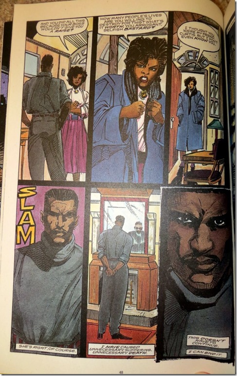
His platonic friend eventually learns his story and tell him he’s a jerk:
milestone_hardware_comic

The platonic friend is very one-note, she’s just there to tell Hardware he’s a jerk.
This book just never transcends the superhero tropes. There’s the Iron Man Sort of guy, the jerk boss Norman Osborn/ businessman Luther sort of guy, later on, there’s a multi part story where McDuffie has Hardware fight a Punisher pastiche, and sure there’ a twist on Marvel’s “The Punisher” but I’m like really, who cares?

 
Another problem with the book is there’s little sense Hardware is in any real danger. It’s as if you had a comic based around Iron-man fighting The Kingpin.  Iron-man  is too powerful: he could just fly over and nuke Kingpin, there’s no real competition.McDuffie co-created Icon and Static around the same time he created Hardware, and my sense is that both are better books with far more relatable characters.

Pantheon High Volume 1

Storytellers: Written by Paul Benjamin, art by Steven and Megumi Cummings
Publisher: Tokyopop
Year of Publication: 2006
Page Count: Around 160 pages

What I learned about Writing/Storytelling:

1.  There’s some neat fatalism with a girl who is destined to have an arm cut off, which is a neat trope.

2.  There’s some neat world building. The book takes a different approach from stories like Harry Potter, which set magic and mystery in the real world, but hidden from normal people.  This just creates an alternate history (apparently) where god’s live out in the open.

What I learned about art/storytelling:
1. I am by no means a perfect reader, and some of the trouble could have been on my end, but, that said, I had trouble visually differentiating between some of the characters in this book.
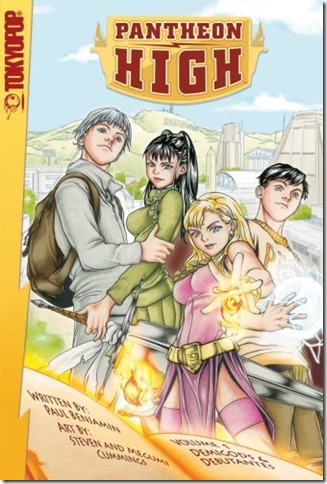
It seems to me that the artists had some trouble differentiating faces:
Pantheon high cover
The two boys are drawn with the same face and slightly different eyes, it seems to me.

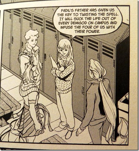
One problem I had was thinking this character:
Girl at locker room
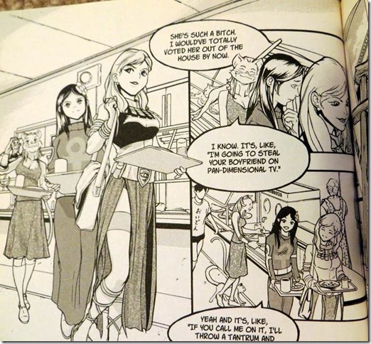
And this character:
Girl at cafateria
were the same character, just with different clothing on.  (There was a scene in a locker room, which could have implied she changed clothing).

Another thing I noticed when flipping through the book is that there are very few panels with all four heroes together. Sometimes that’s because the heroes were separated,  but sometimes they were together but the artists didn’t  draw them all at once.

For clarity’s sake, this book demonstrates that there seems to be an argument in favor of those splash images with the whole team in profile, so the reader can make sure they get how everyone looks in comparison to everyone else.

In a color book, they could differentiate the look of the characters more through hair color or skin tone. As this is black and white, they could have used things like hats, hair accessories, and hair styles, as well as facial shapes.

Recommendation: D+

Notes/Reviews/Synopsis:
I wasn’t sure whether to give this a C- or D+.  There’s actually some good stuff here, but it doesn’t seem to jell together as well as it should. One symptom is the dramatic, climatic fight scenes where we have up-skirt panty shot of one of the girls (a daughter of a God of War, no less) as she engages in the fighting. It seems like that art choice played against the story drama.  Overall, I think my muddled confusion of trying to distinguish some characters prevented me from getting into the plot.

Additionally, things felt a little too hectic and busy:I think I’d prefer if they told the story with less scenes but gave the remaining scenes more time to breath.

To be honest, I suspect I may be a little too harsh on this book, which was solid in many ways… but since I didn’t enjoy it as I was reading it I’m giving it the D+.

Youngblood

Title

: Youngblood
Storytellers: Alan Moore and Steve Skroce
Publisher: Awesome Comics
Year of Publication: 1998
Page Count 3 issues (around 70 pages)

What I learned about writing/storytelling:
1.  Moore keeps the panel count fairly low

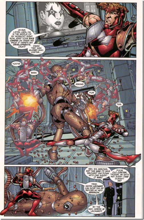
2.  Sometimes it’s amazing how much Moore can do in just a few panels.  For example, here, in just three panels, he has Shaft talk to Twilight, Shaft take down a robot, Waxy Doyle enter the room and chat with Shaft.
In youngblood comic shaft fights a training robot
To some extent he does this by having the dialogue describe what is happening, so a single image can, through dialogue, be made into more than one moment in time.  (In this case the “damn that was close” line in panel 1 is a beat after the earlier dialogue, extending the time flow of the panel).

3.  Moore starts issues 1 and 2 with a “prologue” sequence, labeled as such, that sets up who the villains will be for both self contained stories.  Issue 3 doesn’t use a prologue, but the action starts early on with bad guys attacking Youngblood HQ.  This is a very action packed book, and Moore gets the story rolling right away by introducing the bad guys.

4.  Issues 1 has no cliffhanger.  Issue 2 is self contained but has a final page with a cliffhanger/ lead in to the next issue.  Issue 3 is a cliffhanger.  Issue 4 (only available in script form) ends that storyline but has an epilogue setting up the next storyline.  This is actually unusual for Moore, who usually doesn’t do these sort of cliffhanger lead ins to the next story.

5.  I noticed Moore does fancy transitions where it made sense (Like in Youngblood HQ they see Twilight on the monitor, then we cut to Twilight in the field doing her thing)  but there were sequences where it just went to the next scene after the page turn or used a voice over without a fancy transitional setup.  So, I guess if Moore didn’t think of a fancy transition, he was willing to jump cut on the page turn.

What I learned about art/storytelling:
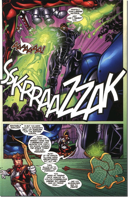
Artist Steve Skroce occasionally has characters cross the panel borders during a fight scene, but he does it with a lot of restraint, and I don’t think it hurts the storytelling because its used sparingly and in a minimalistic way.  See the image above, also this example:
clip_image002
Skroce does not seem to cross the panel border during the non action scenes or pages with a fixed camera.

Recommendation: A

Notes/Reviews/Synopsis:  This is a reread of a book I like a lot.  Alan Moore’s Youngblood is sort of New Teen Titans done right. Frustratingly, only 3 issues came out (and 6 pages are missing from issue 3, apparently cut to save money).  There’s a few leaked scripts for additional issues on the Internet, though I haven’t gotten around to reading them all.

Kamikaze Kaito Jeanne

Storyteller:: Arina Tanemura
Publisher: CMX
Year of Publication: 1998 (In Japan)
Page Count: 172

What I Learned about Writing/ Storytelling:

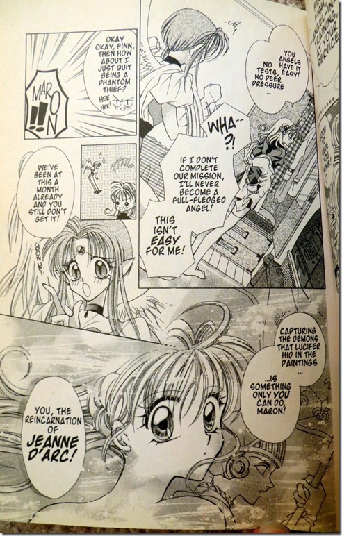
1. This story uses a lot of familiar magical girl superhero tropes (at least, they would be familiar if you’ve read Sailor Moon or Cardcaptor Sakura) so one thing the author does to maintain interest in the first chapter is to skip the origin stuff.  As the story begins, our heroine has been battling bad guys for a month.  Exposition is filled in when she casually threatens to quit her job and her pixy-ish angel sidekick reminds her why she has to save the world:

kamikaze kaito jeanne origin story discusison

Now you could argue that the author is having a character say to another character what they both already know, and that’s “bad”, but the counter argument would be that it fills the reader in pretty quickly upfront and keeps the plot moving along, which makes it “good”.

2.  So, instead of having an origin and exposition issue we get a typical adventure in the first chapter with a twist in the end, a boy rival shows up! Is he good, or is he evil?  If you think about structure… many stories begin with a status quo, then an “inciting incident” turns things upside down in the protagonist’s life.  Well, here, instead of the inciting incident being “girl gets powers” its “girl with powers meets mysterious boy”.  This is probably a good way to write for a genre savvy audience.

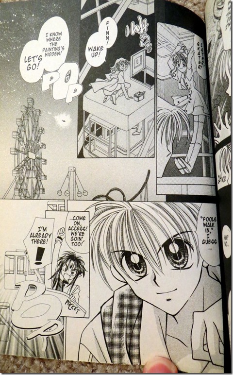
3.  I liked how the girl was fairly cocky and not very angsty.  On this page she climbs a Ferris wheel car without concern or angst about the height:

kamikaze kaito jeanne- jeanne jumps off ferris wheel
It’s kind of a nice change of pace from some overly melodramatic protagonists.

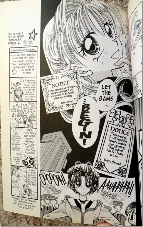
4. There’s definitely some genre mash-up going on.  She’s a phantom thief, but she only steals paintings possessed with demons, which means she’s basically a superhero. But she taunts the police by announcing which painting she’s going to steal next, which is part of Lupin-esque thief genre. She also has a friend who is the daughter of a police detective and wants to catch her (not knowing her secret identity). She taunts the friend and the police like Lupin:
kamikaze kaito jeanne- thief announces crime
I guess this demonstrates a way you can try to mix some tropes to make them work in a different genre. (Superhero story with thief elements).

What I Learned About Art/ Storytelling:

Well, it’s shoujo, so the art tries to convey an emotion at times rather than give a literal depiction.  You can see in the image above the letters aren’t anywhere in particular, but it shifts to a solid establishing shot of the detective girl with a bunch of police, waiting for the thief to show up. So, it does abstract art but tones that down when it’s important to show the characters in physical space 

Recommendation: B

Notes/Review/Synopsis:
This definitely isn’t going to be in the running as one of my favorite comics, though it probably reads better if you’re a tween girl.  I can’t really find much to pick at or complain about, however, so I’m giving it a B.  It’s solidly done.

Prophet

Storytellers:  Brandom Graham with three other writer-artists
Publisher: Image
Year of Publication: 2012
Page Count: 6 issues, collects Prophet 21-26
What I learned about writing/Storytelling

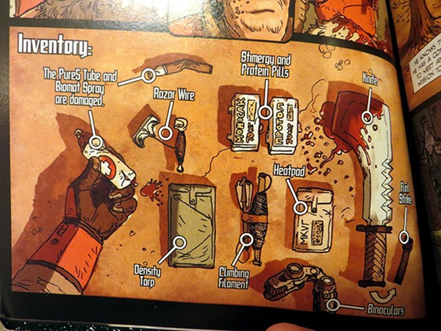
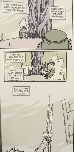
1. I enjoyed this bit that uses text and pointers to show the protagonist’s  scifi gizmos:
weapons with text in propht comic

2.  These alien robot things are humanized though the first person narration, which I guess shows you can play around with what is human and what is not through text scifi tropes (you still have the problem of the lack of relatable body language though):
robot has narration in prophet comic

3.  There’s some interesting scifi concepts, like living spaceship mother AI things. (Which I think I’ve  seen before in an Outer Limits episode, but it’s still cool.)

4.  Scifi terminology can get really offputting.

What I learned about art/storytelling:
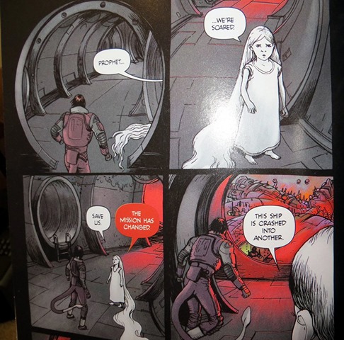
1.  There’s a visual alien, possibly due to the coloring.  I’m talking about this thing:
alien thing in Prophet comic

To me the coloring of the girl makes it look like she has a different art style than the rest of the book, which would make her a visual alien.  Looking at this art, it’s clear the coloring choice brings three dimensionality to the image.

2.  There’s definitely contrast in lighting between indoors and outdoors.  It would be interesting to see if a movie like Prometheus uses pronounced lighting differences, or that’s just a comic thing…

Recommendation: D

Notes/Reviews/Synopsis:
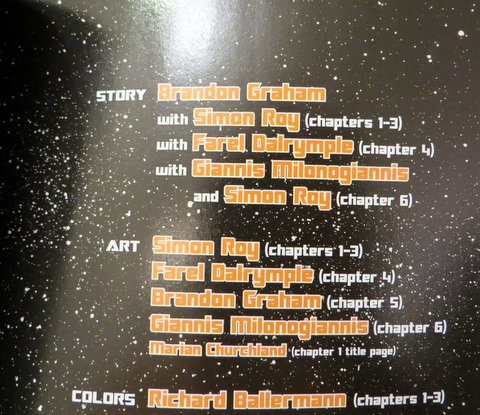
This book has good internet buzz.  That said… I have no idea what I just read. It was incomprehensible to me. My eyes kept glazing over at the alien jargon.  I was a bit tired when I read it, admittedly, but I don’t think that was the problem, but who knows. Even the credit page is causing my eyes to glaze over right now:
clip_image004

Written by Simon Ray, with writer Simon Ray, and drawn by Simon Ray!

The first storyline was comprehensible, in a post apocalyptic Conan The Barbarian in Space sort of way, but after that there’s all these clones running around or something. The third person narration and lack of dialogue made my eyes glaze over, especially as the narration is riddled with incomprehensible made up scifi gibberish terms.

Most of the reviews on Amazon seem positive, though it seems one positive reviewer is familiar with the earlier series, which apparently might help a little, even though this is largely a fresh reboot?  These two Amazon reviews are closer to my view:

This is going to be a short review as I plan on keeping it short. The volume confused me. I really had no idea what was going on. Apparently each “chapter” a new John Prophet would appear and start the story all over again waking from stasis from under the earth’s surface to complete a mission in this new dangerous Earth. This took me some time to figure out so I didn’t have a clue what was happening with each issue shift. … This GN is not for me, nor would I recommend it. However it generally seems to be getting excellent reviews. I enjoy science fiction but I am not hard-core, perhaps this would appeal more to those associated with that term

Another one star review:

“Prophet has been hyped up by comic blogs for months which made it sound really interesting and the concept is. However the execution of it dragged literally prophet dragged himself around from one point to another. The writing was pretty confusing and could probably have been so much better. If you find this at a library check it out. If you are really curious about the relaunch of a Prophet go for it but for any real substance skip this.”

So yeah, I don’t recommend getting this book.

Runaways Volume 4: True Believers

Storytellers:  Brian Vaughan and Adrian Alphona
Publisher: Marvel Comics
Year of Publication: 2005
Page Count: 6 issues, Collects Runaways Volume 2 #1-6

What I learned about writing/Storytelling
1.  Vaughan does a good job of working in exposition for new readers coming into Volume 2, and does it in a natural sounding way.  He starts with the Wrecking Crew robbing a bank. They talk about the fact that they can now engage in crimes on the West Coast, since the Pride organization is out of business. Then, our heroes show up, each displaying their power while making a quip that states their background.  (A bad guy says “They’re muties!” The alien girl responds “Excuse me. I’m an extraterrestrial… and proud of it” and the mutant girl says “besides, the word ‘mutie’ is offensive to people like me.” A bad guy later says  “Wizards, gene freaks, time travelers, you’re The Pride’s kids, ain’t you?” completing the exposition.

In issue 2, he recaps the exposition again, without sounding unnatural, by having people briefed on the kids:
exposition page from Runaways volume 2

(That page also demonstrates how minimalistic Vaughan’s dialogue can be while still communicating a lot of information. Vaughan talks about comic writing as being like writing a Haiku, and tries to cut down on dialogue and panel count.)

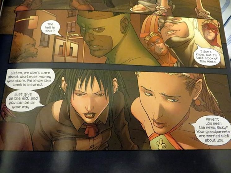
2.  Establishing a unique tone for your book early on is always a good thing.  Vaughan does this upfront by showing his heroes don’t care about the money stolen from the bank:

Runaways heroes don't care about stolen money

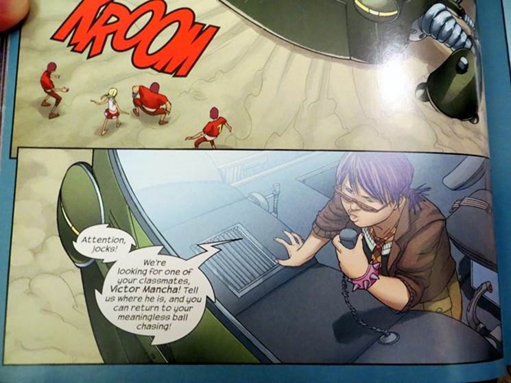
3.  There’s a lot of great dialogue here.  Vaughan gives his characters unique voices. Here’s an example of a line that can only be said by this particular character, but you can also imagine him writing the scene five different ways with each of his five characters asking about the classmate in a different way:

good dialogue from Runaways

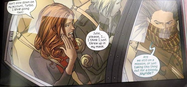
4.  Having different characters react differently to a situation is a decent dramatic strategy for a team book.  Here, we have a character excited about driving fast and another nervous:

Runaways driving fast

What I learned about art/storytelling:
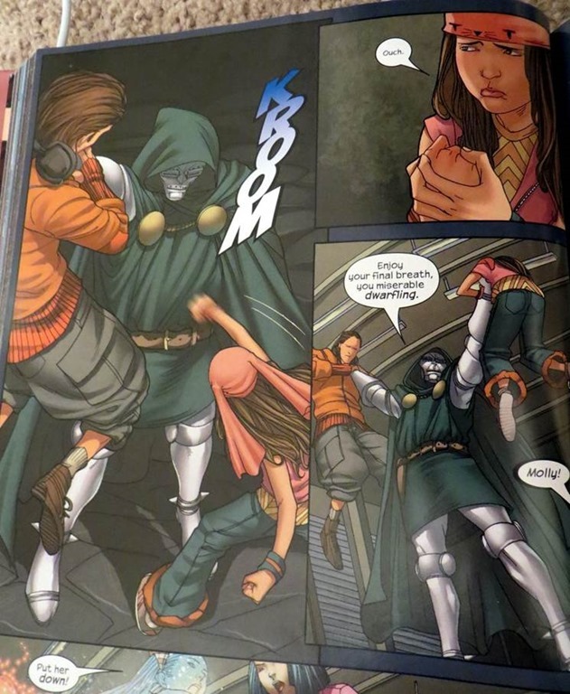
1. This image didn’t completely work for me, as the second panel doesn’t feel like its happening in the middle of a fight, it seems like an isolated moment of time.

Runaways fight scene

It seems in a fight, you really have to choose angles and images that maintain the intensity.

Recommendation: B+

Notes/Reviews/Synopsis:
This is a reread, since I wanted to look at something I knew I would like. The book is certainly good. My main quibble, that prevents it from getting an A, is the fact that there’s some lulls where there isn’t a strong sense of story progression or story structure, and I’m like “Huh. That is kinda just a book about kids running away as people chase them.” In volume 1, they are running from their parents, in volume 2, it’s third rate Avengers characters, which is inherently less dramatic.  While it does come together into something interesting by the end, there’s maybe a little too much decompressed chase stuff. Also, come to think of it, the premise lacks urgency, since it involves an Ultron plot not meant to come to fruition for a decade.

The New Teen Titans: Terra Incognito

Storytellers: Marv Wolfman and George Perez
Publisher: DC Comics
Year of Publication: 1982-1983
Page Count: New Teen Titans 26, 28-34, New Teen Titans Annual 2 (222 pages)

What I learned about Writing/Storytelling:

1.  There’s an old Japanese movie Rashoman, where everyone is interviewed about an event and recounts a different version of what happened. A million different stories have been written riffing on it, and Marv Wolfman comes up with a clever twist on the formula in in Teen Titans 33. A super-villain named “Trident” is found murdered, and the Teen Titans sit around discussing the mystery. It turns out many of them have fought Trident on separate occasions, but, they realize, none of their stories add up, Trident appears to have had different powers on different occasions. The Titans come to realize there must be more than one “Trident”, and they eventually track down the second criminal.  The demonstrates a method of playing around with an old formula.

What I learned about art/storytelling:
Perez is definitely a pro, and the camera angles have a lot of diversity and are a lot more interesting than in the JLI art I discussed earlier.  For example, in the image below, due to a savvy choice of camera angle, we get a powerful image and a true sense that Terra is falling to her death:
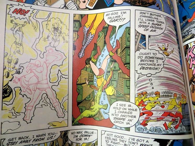
Terra is falling and needs rescuing

Here’s a fun little sequence:

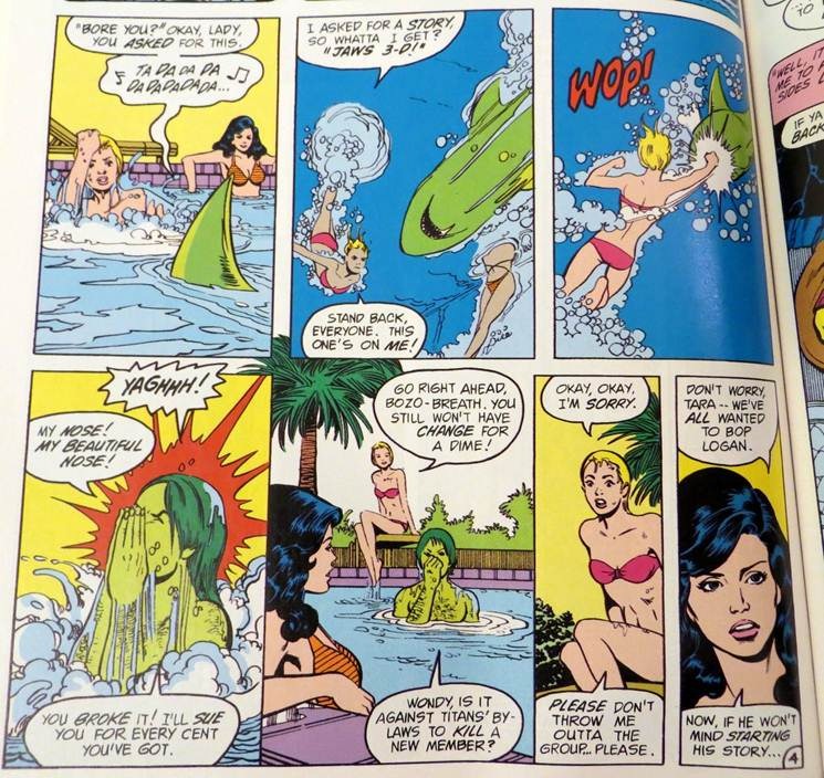
Terra punches Beast Boy in the pool

I would never have consciously noticed this if I wasn’t looking at it closely for purposes of this review, but the panel with the white background runs behind the other panels, given a sense of open landscape.  It works fine, while sticking to a fairly readable, traditional layout.

Recommendation: C+

Notes/Reviews/Synopsis:
Yeah, this isn’t a very good comic.  I know this was DC’s most popular comic back in the day.  That it’s historically important, and even one of the first superhero books with interesting female characters.  That said… I didn’t find it fun to read at all.
Given a story that could be told in 20 panels, this team chooses 80. 

For example, the opening plot involves a group of villains planning to abduct Raven for a nefarious scheme. It’s a serviceable plot, but instead of getting to it, we have a scene of the villains fighting a different group of villains, a scene of the villains apparently getting killed, a scene showing the villains survived and are preparing to strike at Raven, a scene where they attack Raven at Titans headquarters and get their asses kicked, a scene where Raven runs away due to teen angst, a scene where the villains escape capture after the fight, a scene where the villains ambush Raven in the church where she’s meditating alone, a scene where Raven escapes, a scene where the bad guys track her down in the city, yet again a scene where the Titans come to Raven’s rescue but lose the fight. And finally, we get on with the plot: villains have kidnapped Raven and the Titans come rescue her:
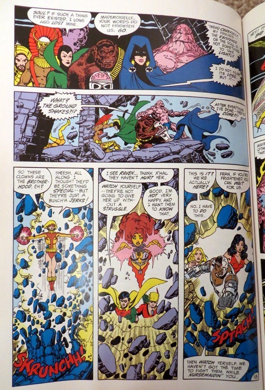
The Teen Titans burst in to recsue Raven

That page was fun enough… but ooooh, the tediousness to get to it.
The character stuff with Terra was neat, but then it turns out, apparently, it was all a lie and she was a wolf in sheep’s clothing all along.  I think it would have been better if they did some sort of Total Recall fake memory thing with Terra.  What’s the point of all of these scenes, building character, if it’s all just an act?

I guess it’s possible a villain could generate alligator tears at will, as Terra does here, apparently:
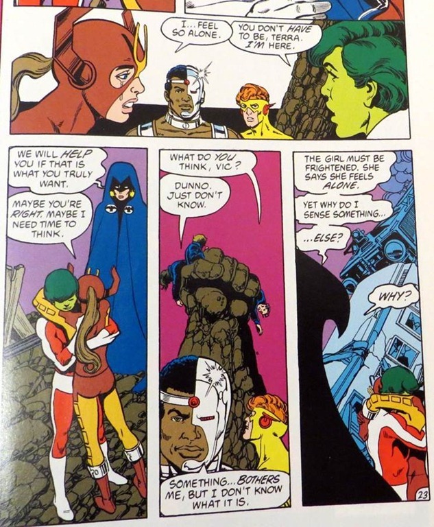
Terra cries because she feels alone

but.. it sort of ruins what little emotional resonance there is in the book upon rereading.
There are other issues, such as the need to wedge in soap opera melodrama as much as possible for it’s own sake.

When Raven complains every issue that that it’s hard to control her emotions, and Kid Flash complains every issue that he’s thinking of quitting the team to focus on college, it becomes wearisome and you want to shout “For God’s sake! Turn evil or don’t turn evil, leave for college or decide to stick around, make a decision,any decision, just stop your whining!”  Reading an issue only once every 30 days back in the 80s, this might have worked better, you were following the characters on a journey, and it was less about the quality of the writing, per see, but more about how the characters were growing up with you.
Fantastic Four Volume 1 (Hickman run)

Storytellers: Jonathan Hickman, Dale Eaglesham, Neil Edwards
Publisher:  Marvel Comics
Year of Publication: 2009-2010
Page count:  5 issues, Fantastic Four 570-574

What I learned about writing/storytelling:
In the first story, Reed joins an inter dimensional superhero team, but it means he has to spend a lot of time away from his family. So there’s a superhero subplot, and a personal life subplot.  You could even say its about a workaholic dad who has to decide whether to put family first, and the inter dimensional stuff is just wallpaper.  It’s not particularly groundbreaking or anything, but its ok for what it is…

What I learned about art/storytelling:
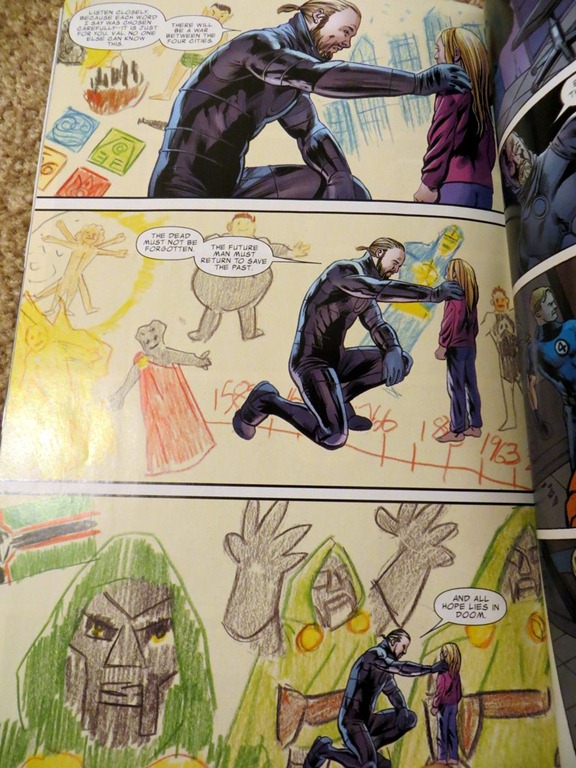
Not much. The art seemed pretty generic to me.  This part, with a different stylistic background, was the only bit that stood out:
Fantastic Four page with children style art in the backround

It doesn’t seem like the sort of thing you’d want to do often, though.

Recommendation: C

Notes/Review/Synopsis:
The first story involved Reed Richards joining a club of alternate reality versions of himself. It was ok, but pretty forgettable, especially if you’ve read the earlier comics that have already done this sort of thing: I know Captain Britain did it, Tom Strong did it, Supreme did it, and the mind control subplot originates from Doc Savage, and was used in Squadron Supreme and Tom Strong. Plus, I think there were alternative versions of Reed Richards in some old Fantastic Four comics from the 90s.

There was a one shot story that was completely incomprehensible, either due to being a sequel to another story or a crossover– some poorly paced gibberish about an alternate earth overrun by Ultrons.

Finally there was story material about Franklin Richard having a birthday party, featuring obscure characters like Leech and Power Pack who I’m not familiar with and have no reason to care about.  Poorly explained continuity porn, basically. The final 10 pages of the book were more promising, as a version of Franklin from the future comes and causes trouble. There’s an ironic bit where Sue, not knowing who he is and thinking he’s hurt her son, threatens to hunt him down and kill him.  That was clever.

A cosmic epic was foreshadowed, and it sounds interesting, but after wasting my time with 5 issues of continuity porn and by the book genre stuff, I’m not sure I’d come back, especially because the future volumes probably will involve crossovers.

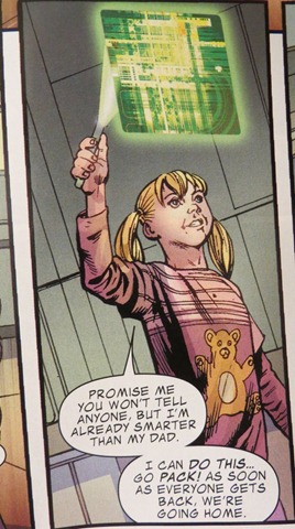
The characterization ranged from decent to so-so. Hickman’s main way of making the three year old girl seem super smart is to have her say she’s super smart and solve plot problems, it doesn’t really stand out from the dialogue:

super smart girl say she's super smart

It seems like he could have done it a bit better.

Kingdom of the Wind

Storytellers: Story and art by Kimjin
Publisher:  Netcomics
Year of Publication: First published 1992
Page count:  210 pages

What I learned about writing/storytelling:
1.  The main character’s older brother, the former crown prince, was forced to commit suicide by his father, the king. The story doesn’t don’t directly state the reason why at first, but it references the death of the older brother a few times before finally the king explains that he felt the son would revolt against him.  This is sort of a “peeling an onion” approach to storytelling. It’s similar to a subplot in Big Numbers, with the foreign shopkeepers who speak untranslated foreign dialogue in issues 1 and 2.  In issue 3, Moore translates the dialogue and we understand the husband and wife in a way we didn’t before.

2.  There are some interesting tropes. The protagonists are the royal family of a kingdom formed by a prince who left the neighboring land.  A demon from a neighboring kingdom wishes to wipe out the new land for the benefit of the neighboring family, so the plot involves a sort of a distant family squabble.   This gave the book a Beowulf feel to me (or maybe the Gaiman version of Beowulf, which increased the family aspect of the story) with a demon hunting down a family due to the actions of their ancestor.

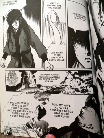
Another trope I found interesting: the main character are the crown prince and his sister. The crown prince is married, and the book also features the wife and a newly born child.  The sister is single and has more leeway to move about, so tries to hunt down the monster and do other things to help the brother while he’s tied to his responsibilities towards his nation and family family. The monster either has a “male and female” aspect or is a husband and wife monster pair, the translation is ambiguous: (this is Korean so reads left to right).

clip_image001

(the translation says Mupa refers to female half.)  This perhaps if intended to mirror the brother and sister’s alliance with a male and female shadow enemy. 

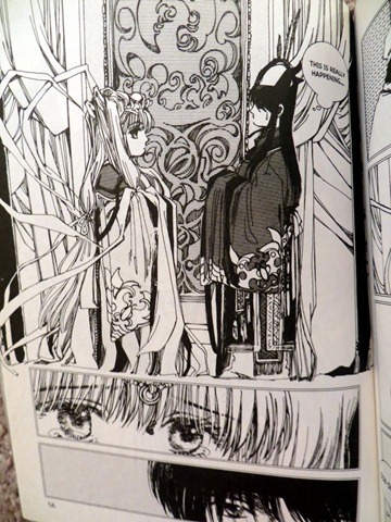
3.  There’s a decent use of flashbacks, like this bit showing how the crown prince and his wife were arranged to be married when they were both very young:

clip_image002

This would seem to be a device to make you care about the characters more than you would otherwise, since the author has fleshed out their past. Plus it’s just plain interesting to see the kids reacting to the arranged marriage.

What I learned about art/storytelling:
Nothing here.  Didn’t really care for the art.

Recommendation:  C-

Notes/Review/Synopsis:
This was a completely random book I grabbed from the library, I came in with no expectations.  (Indeed I have no idea whether Kimjin is a male or female name or neutral pen name, or whether the demographic this is aimed at is boys or girls or both, the style seems a bit shoujo but who knows…)

Some of the tropes were interesting, but this story did not come together for me. The art was not always clear, especially in the fight scenes, and the foreign names and references were a little hard to keep track of, which may be nobody’s fault but my own..  Overall, the story didn’t grab my attention and flow for me, which may be a pacing issue.