Pantheon High Volume 1

Storytellers: Written by Paul Benjamin, art by Steven and Megumi Cummings
Publisher: Tokyopop
Year of Publication: 2006
Page Count: Around 160 pages

What I learned about Writing/Storytelling:

1.  There’s some neat fatalism with a girl who is destined to have an arm cut off, which is a neat trope.

2.  There’s some neat world building. The book takes a different approach from stories like Harry Potter, which set magic and mystery in the real world, but hidden from normal people.  This just creates an alternate history (apparently) where god’s live out in the open.

What I learned about art/storytelling:
1. I am by no means a perfect reader, and some of the trouble could have been on my end, but, that said, I had trouble visually differentiating between some of the characters in this book.
It seems to me that the artists had some trouble differentiating faces:
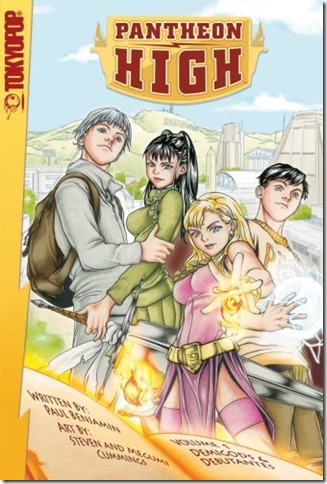
Pantheon high cover
The two boys are drawn with the same face and slightly different eyes, it seems to me.

One problem I had was thinking this character:
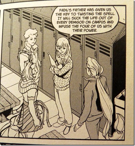
Girl at locker room
And this character:
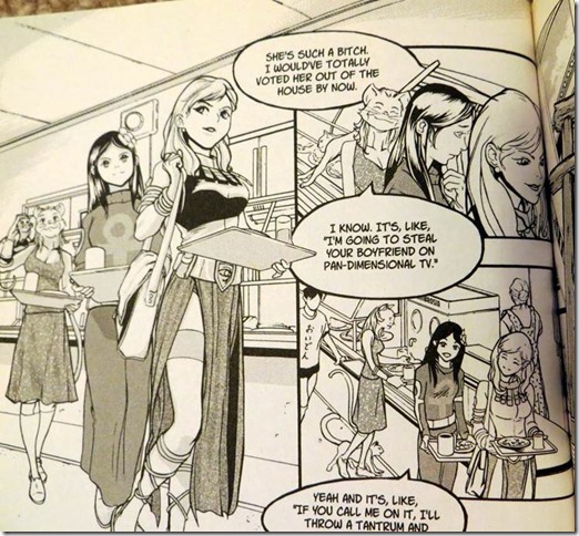
Girl at cafateria
were the same character, just with different clothing on.  (There was a scene in a locker room, which could have implied she changed clothing).

Another thing I noticed when flipping through the book is that there are very few panels with all four heroes together. Sometimes that’s because the heroes were separated,  but sometimes they were together but the artists didn’t  draw them all at once.

For clarity’s sake, this book demonstrates that there seems to be an argument in favor of those splash images with the whole team in profile, so the reader can make sure they get how everyone looks in comparison to everyone else.

In a color book, they could differentiate the look of the characters more through hair color or skin tone. As this is black and white, they could have used things like hats, hair accessories, and hair styles, as well as facial shapes.

Recommendation: D+

Notes/Reviews/Synopsis:
I wasn’t sure whether to give this a C- or D+.  There’s actually some good stuff here, but it doesn’t seem to jell together as well as it should. One symptom is the dramatic, climatic fight scenes where we have up-skirt panty shot of one of the girls (a daughter of a God of War, no less) as she engages in the fighting. It seems like that art choice played against the story drama.  Overall, I think my muddled confusion of trying to distinguish some characters prevented me from getting into the plot.

Additionally, things felt a little too hectic and busy:I think I’d prefer if they told the story with less scenes but gave the remaining scenes more time to breath.

To be honest, I suspect I may be a little too harsh on this book, which was solid in many ways… but since I didn’t enjoy it as I was reading it I’m giving it the D+.
Youngblood

Title

: Youngblood
Storytellers: Alan Moore and Steve Skroce
Publisher: Awesome Comics
Year of Publication: 1998
Page Count 3 issues (around 70 pages)

What I learned about writing/storytelling:
1.  Moore keeps the panel count fairly low

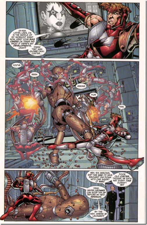
2.  Sometimes it’s amazing how much Moore can do in just a few panels.  For example, here, in just three panels, he has Shaft talk to Twilight, Shaft take down a robot, Waxy Doyle enter the room and chat with Shaft.
In youngblood comic shaft fights a training robot
To some extent he does this by having the dialogue describe what is happening, so a single image can, through dialogue, be made into more than one moment in time.  (In this case the “damn that was close” line in panel 1 is a beat after the earlier dialogue, extending the time flow of the panel).

3.  Moore starts issues 1 and 2 with a “prologue” sequence, labeled as such, that sets up who the villains will be for both self contained stories.  Issue 3 doesn’t use a prologue, but the action starts early on with bad guys attacking Youngblood HQ.  This is a very action packed book, and Moore gets the story rolling right away by introducing the bad guys.

4.  Issues 1 has no cliffhanger.  Issue 2 is self contained but has a final page with a cliffhanger/ lead in to the next issue.  Issue 3 is a cliffhanger.  Issue 4 (only available in script form) ends that storyline but has an epilogue setting up the next storyline.  This is actually unusual for Moore, who usually doesn’t do these sort of cliffhanger lead ins to the next story.

5.  I noticed Moore does fancy transitions where it made sense (Like in Youngblood HQ they see Twilight on the monitor, then we cut to Twilight in the field doing her thing)  but there were sequences where it just went to the next scene after the page turn or used a voice over without a fancy transitional setup.  So, I guess if Moore didn’t think of a fancy transition, he was willing to jump cut on the page turn.

What I learned about art/storytelling:
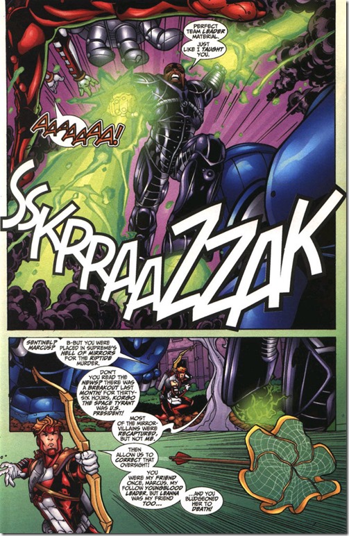
Artist Steve Skroce occasionally has characters cross the panel borders during a fight scene, but he does it with a lot of restraint, and I don’t think it hurts the storytelling because its used sparingly and in a minimalistic way.  See the image above, also this example:
clip_image002
Skroce does not seem to cross the panel border during the non action scenes or pages with a fixed camera.

Recommendation: A

Notes/Reviews/Synopsis:  This is a reread of a book I like a lot.  Alan Moore’s Youngblood is sort of New Teen Titans done right. Frustratingly, only 3 issues came out (and 6 pages are missing from issue 3, apparently cut to save money).  There’s a few leaked scripts for additional issues on the Internet, though I haven’t gotten around to reading them all.

Kamikaze Kaito Jeanne

Storyteller:: Arina Tanemura
Publisher: CMX
Year of Publication: 1998 (In Japan)
Page Count: 172

What I Learned about Writing/ Storytelling:

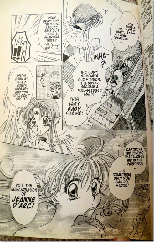
1. This story uses a lot of familiar magical girl superhero tropes (at least, they would be familiar if you’ve read Sailor Moon or Cardcaptor Sakura) so one thing the author does to maintain interest in the first chapter is to skip the origin stuff.  As the story begins, our heroine has been battling bad guys for a month.  Exposition is filled in when she casually threatens to quit her job and her pixy-ish angel sidekick reminds her why she has to save the world:

kamikaze kaito jeanne origin story discusison

Now you could argue that the author is having a character say to another character what they both already know, and that’s “bad”, but the counter argument would be that it fills the reader in pretty quickly upfront and keeps the plot moving along, which makes it “good”.

2.  So, instead of having an origin and exposition issue we get a typical adventure in the first chapter with a twist in the end, a boy rival shows up! Is he good, or is he evil?  If you think about structure… many stories begin with a status quo, then an “inciting incident” turns things upside down in the protagonist’s life.  Well, here, instead of the inciting incident being “girl gets powers” its “girl with powers meets mysterious boy”.  This is probably a good way to write for a genre savvy audience.

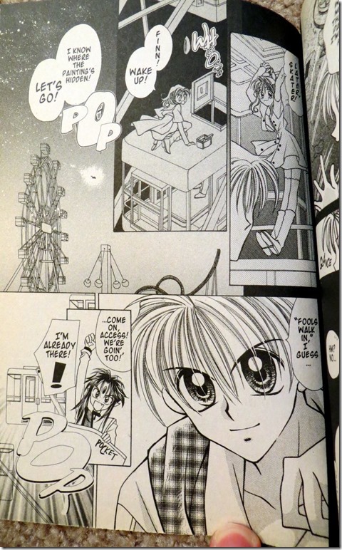
3.  I liked how the girl was fairly cocky and not very angsty.  On this page she climbs a Ferris wheel car without concern or angst about the height:

kamikaze kaito jeanne- jeanne jumps off ferris wheel
It’s kind of a nice change of pace from some overly melodramatic protagonists.

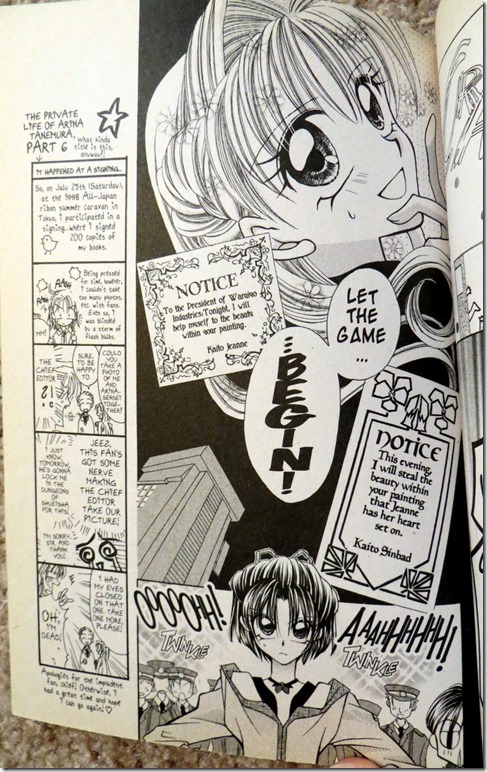
4. There’s definitely some genre mash-up going on.  She’s a phantom thief, but she only steals paintings possessed with demons, which means she’s basically a superhero. But she taunts the police by announcing which painting she’s going to steal next, which is part of Lupin-esque thief genre. She also has a friend who is the daughter of a police detective and wants to catch her (not knowing her secret identity). She taunts the friend and the police like Lupin:
kamikaze kaito jeanne- thief announces crime
I guess this demonstrates a way you can try to mix some tropes to make them work in a different genre. (Superhero story with thief elements).

What I Learned About Art/ Storytelling:

Well, it’s shoujo, so the art tries to convey an emotion at times rather than give a literal depiction.  You can see in the image above the letters aren’t anywhere in particular, but it shifts to a solid establishing shot of the detective girl with a bunch of police, waiting for the thief to show up. So, it does abstract art but tones that down when it’s important to show the characters in physical space 

Recommendation: B

Notes/Review/Synopsis:
This definitely isn’t going to be in the running as one of my favorite comics, though it probably reads better if you’re a tween girl.  I can’t really find much to pick at or complain about, however, so I’m giving it a B.  It’s solidly done.